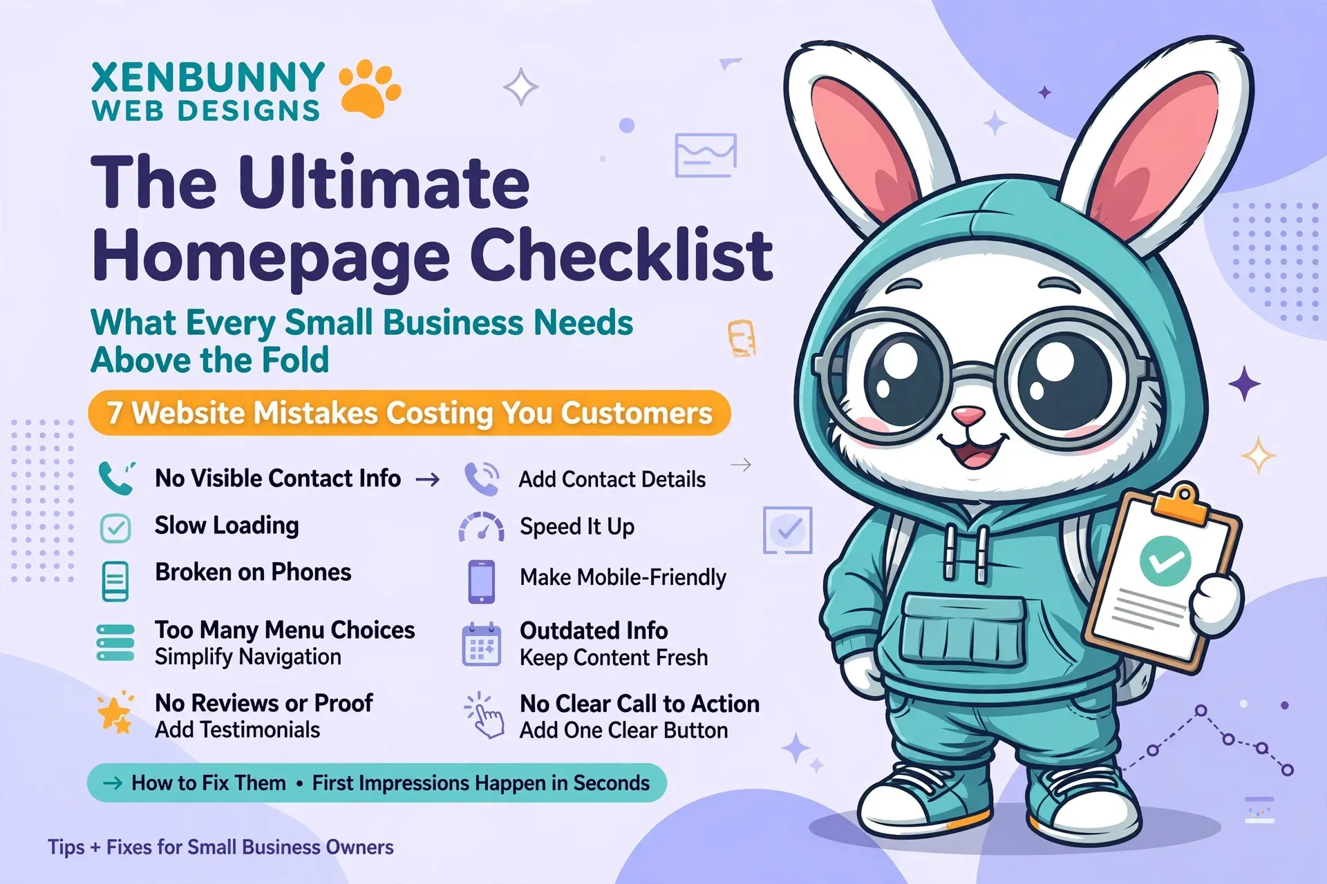
The Ultimate Homepage Checklist: What Every Small Business Needs Above the Fold
Your homepage has only a few seconds to answer the questions running through a new visitor's mind.
Who are you? What do you do? And what should I click next? 💜Let's make sure the first screen of your website answers all three.
It doesn't need to explain your entire business. Its job is simpler: help the right visitor quickly understand where they've landed, why they should care and what they can do next.
Start With the 5-Second Test
Imagine someone has never heard of your business. They land on your homepage and look at it for five seconds.
Could they answer these questions?
- What does this business do?
- Who is it for?
- Why might I choose this company?
- What should I do next?
A Clear, Specific Headline
Your headline is some of the most valuable real estate on your homepage.
Don't waste it on a vague phrase that could describe almost any company.
A strong headline should quickly communicate what you offer, who you help or the result your customer is looking for.
Quality You Can Trust
Quality what? Plumbing? Cupcakes? Alpaca grooming? 😂
Custom Websites for Small Businesses
Now the visitor immediately knows what the company offers.
Supporting Text That Adds the Missing Details
Your headline gets attention. Your supporting text provides context.
In one or two short sentences, explain something useful that the headline doesn't cover.
You might clarify:
- Who you serve
- Your service area
- Your biggest benefit
- What makes your approach different
- What type of service or product you specialize in
One Obvious Primary C.T.A.
Once someone understands what you offer, don't make them guess what they're supposed to do next.
Your primary C.T.A. — call to action — should represent the most important next step for a potential customer.
- Get a Free Quote
- Book an Appointment
- Shop Now
- Schedule a Consultation
- View Our Services
- Call Today
Simple Navigation
Your navigation isn't the place to get mysterious.
Visitors should be able to glance at the menu and immediately understand where they'll find the information they need.
A typical small-business menu might include:
- Home
- About
- Services
- Gallery or Portfolio
- Frequently Asked Questions
- Contact
Not every business needs every page, but navigation should feel predictable and easy.
A Hero Image or Visual With a Purpose
Your hero visual should support the message, not compete with it.
Whenever possible, use imagery that helps visitors understand your actual business.
- A finished project
- Your product in use
- Your team performing the service
- Your location or environment
- A strong example from your portfolio
A Reason to Trust You
New visitors don't know you yet.
A small trust signal near the top of the page can help answer the unspoken question: “Is this company legitimate?”
Depending on your business, that might be:
- Your star rating and review count
- Years in business
- Number of customers served
- A professional certification
- A recognizable association or accreditation
- A brief customer testimonial
- Licensed and insured status, when applicable
Don't cram every award you've ever received into the hero. One or two meaningful trust signals can be plenty.
An Easy Way to Contact You
If phone calls matter to your business, don't bury the phone number three pages deep.
On mobile devices especially, a visitor should be able to take action without hunting around.
- Clickable phone number
- Contact button
- Quote request
- Booking button
- Directions for location-based businesses
Remember: “Above the Fold” Changes on Mobile
There isn't one universal fold.
Phones, tablets, laptops and desktop monitors all display different amounts of content.
That's why your most important information needs to remain strong even when the layout stacks vertically.
- Your headline should remain readable
- Your main C.T.A. shouldn't disappear
- Text shouldn't cover important parts of an image
- Buttons should be easy to tap
- The menu should be easy to find and use
- Visitors shouldn't need to zoom
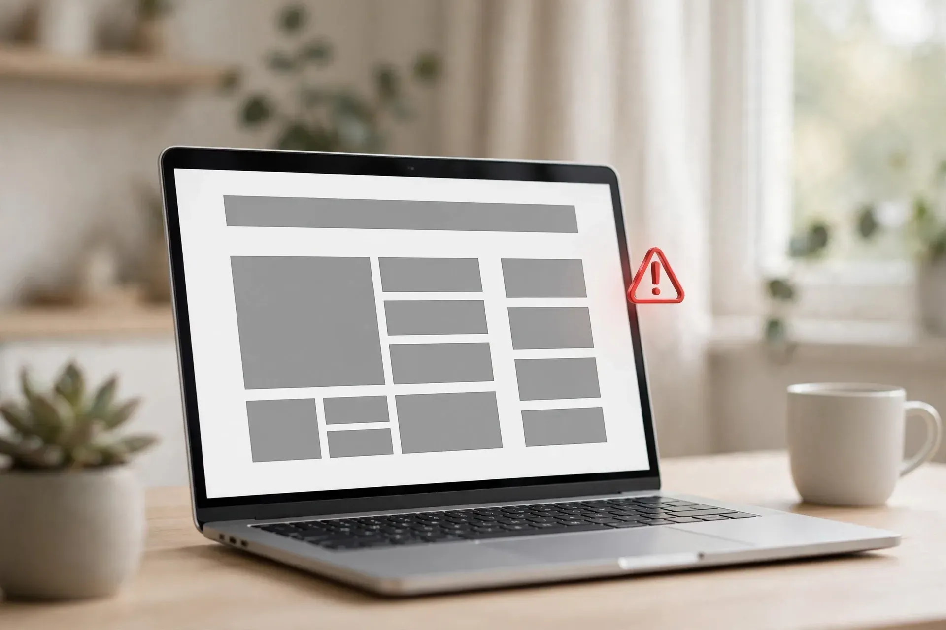
🚫 What NOT to Cram Above the Fold
Your homepage hero isn't a storage closet.
You do not need to squeeze your entire business into the first screen.
- Seven different C.T.A. buttons
- Your entire About Us story
- Every service you have ever offered
- A giant paragraph nobody can scan
- Multiple pop-ups fighting for attention
- A slideshow with six unrelated messages
- Every certification, logo and badge you own
A Simple Above-the-Fold Formula
If you're staring at your homepage wondering what the heck should actually go there, start here:
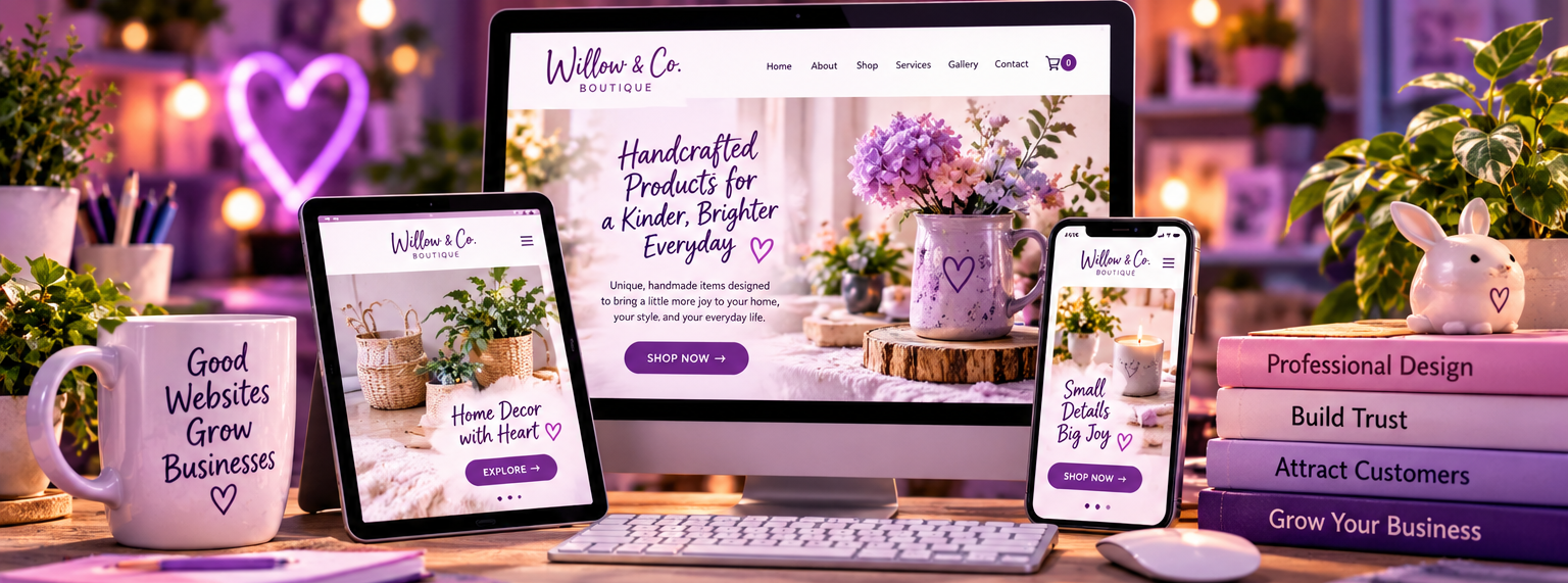
Custom Websites for Small Businesses
Affordable, professional websites designed to help your business look established, connect with customers and grow online.
Then pair it with a relevant visual, simple navigation and a meaningful trust signal.
That's already a much stronger starting point than trying to stuff twenty different messages into the hero.
💜 Grade Your Homepage
Open your website right now and look at the first screen. Give yourself one point for each YES:
- Can I tell what the business does immediately?
- Is the main headline specific and easy to understand?
- Is there useful supporting text?
- Is there one obvious primary C.T.A.?
- Can I easily find the navigation?
- Does the hero image actually relate to the business?
- Is there at least one meaningful trust signal?
- Can customers easily contact the business?
- Does the first screen still work well on a phone?
- Does the page feel clear instead of crowded?
5–7: You've got a foundation, but there's room to improve.
0–4: Your homepage and I need to have a little conversation. 😂
The First Screen Has One Job
It doesn't need to close the sale.
It doesn't need to answer every possible question.
And it definitely doesn't need to contain your entire website.
It simply needs to make the right visitor think:
Then the rest of your homepage can do its job.
Does Your Homepage Pass the 5-Second Test? 💜
If your website feels confusing, outdated, crowded or just doesn't represent your business anymore, Xenbunny can help.
Xenbunny Web Designs creates affordable custom websites for small businesses, entrepreneurs, makers and growing brands.
Let's Talk About Your Website →Xenbunny Web Designs • Where Creativity Meets Digital Brilliance.