
How to Turn Website Visitors Into Paying Customers
Getting people to your website is only half the battle. If visitors browse around and leave without calling, booking, or buying, your site is not doing its job.
Your website shouldn't just sit there looking pretty. It should help bring you business. 💜Getting people to your website is only half the battle.
If visitors browse around and leave without calling, booking, or buying, your site is not doing its job.
The difference between a website that just sits there and one that brings in business usually comes down to a handful of practical details.
Here is how to turn more of your visitors into paying customers.
Tell People Exactly What to Do
Visitors should never have to guess what their next step is.
Every page needs a clear call to action, a button or link that says exactly what to do: Call Now, Book a Free Consultation, Get a Quote, Shop the Collection.
Use plain, specific words.
"Get My Free Quote" tells them exactly what happens next.
Place your main call to action where it cannot be missed, near the top of the page and again at the bottom.
Make It Ridiculously Easy to Contact You
Every extra step between "I'm interested" and "I contacted them" costs you customers.
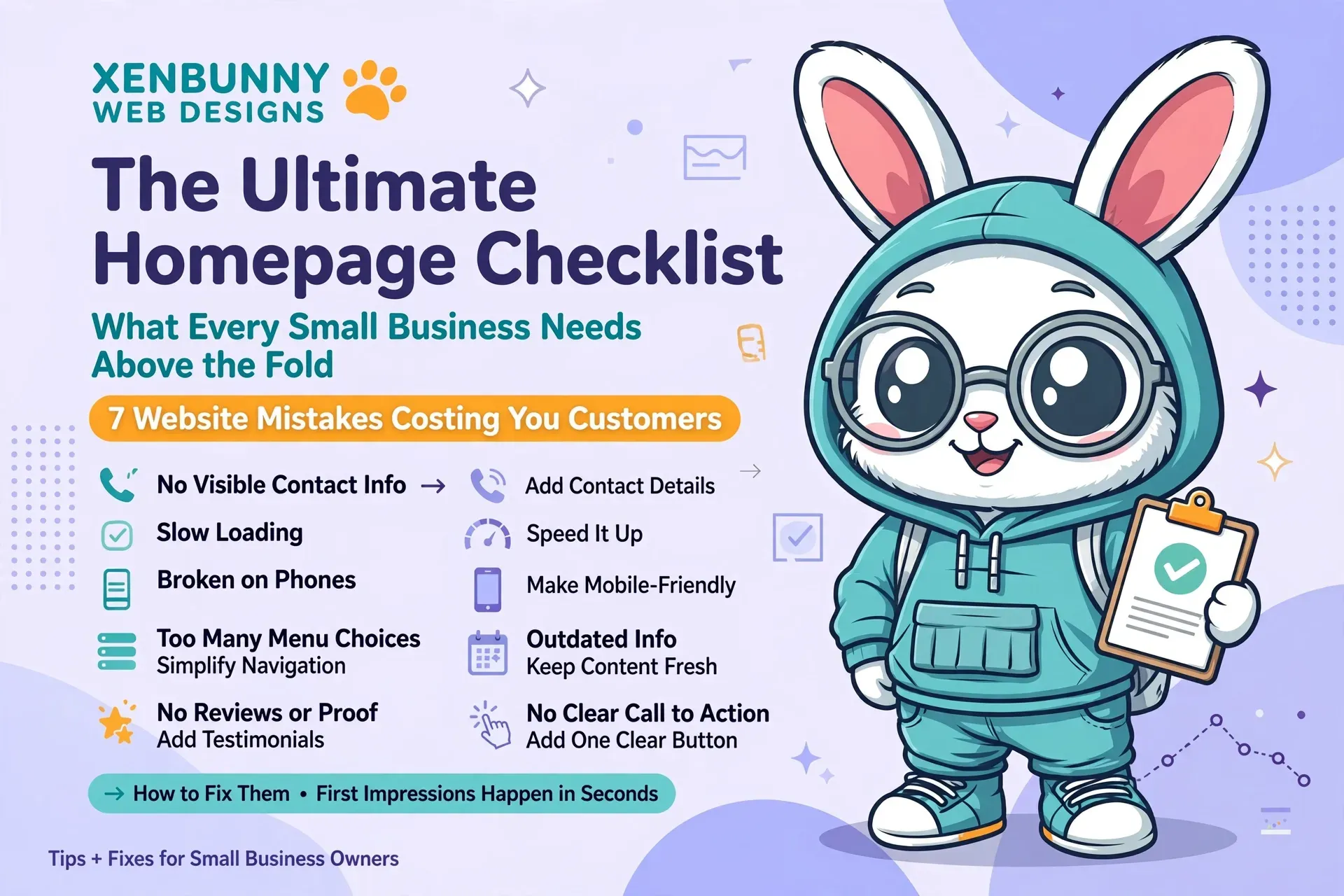
Your phone number should be visible on every page.
Your contact form should ask for the bare minimum: a name, an email or phone number, and a message box.
Long forms with ten required fields feel like homework, and most people will abandon them halfway through.
Show Proof Before They Have to Ask
People buy from businesses they trust, and trust comes from evidence.
Sprinkle proof throughout your site: customer reviews near the top of your homepage, testimonials on your service pages, photos of real finished work, and any certifications or awards you have earned.
Do not make visitors dig for this.
Answer Their Objections on the Page
Every customer has unspoken worries.
How long will it take?
What if something goes wrong?
If your site does not address these questions, visitors will go find a competitor that does.
A simple F.A.Q. section works wonders.
List the questions you hear most often and answer them honestly.
Clear pricing information, even just a starting price or a typical range, removes one of the biggest reasons people hesitate to reach out.
Speed Up and Go Mobile First
A slow site kills conversions.
If your pages take more than a few seconds to load, visitors leave before they ever see your offer.
And since most of your visitors are browsing on phones, your site needs to feel effortless on a small screen: big tappable buttons, readable text, and a contact form that is easy to fill out with one thumb.
Give Every Page One Job
A page that tries to do everything accomplishes nothing.
Each page should have a single goal and a single primary call to action that serves it.
About page: lead to a consultation.
Focused pages convert, while cluttered pages confuse.
💜 Small Changes, Big Difference
You do not need a complete overhaul to see results.
Often, adding a visible phone number, shortening your contact form, and placing a few reviews near the top of your homepage is enough to noticeably lift the number of inquiries you get.
Your Website Should Work for Your Business 💜
And if you want a website engineered from the ground up to convert visitors into customers, that is our specialty.
Xenbunny Web Designs builds custom websites for small businesses where every page, button, and form is designed with one goal in mind: bringing you more business.
Let's Talk About Your Website →Xenbunny Web Designs • Where Creativity Meets Digital Brilliance.